If you follow my adventures on my Facebook page (if you are not a liker of the page, I highly suggest you to become one if you want to be first to here from me about what’s happening in my part of the creative world), you already have seen snippets of this new Nixies over the last few weeks.
Since my husband helped me clear up my Studio, I have this big pile of «never finished»+«ugly» paintings in a box. They need to be reworked… or be entirely redone.
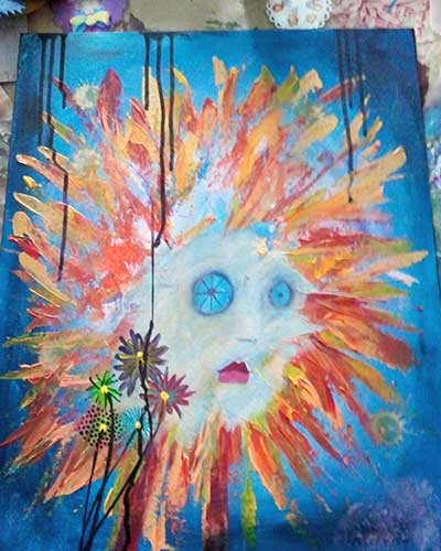
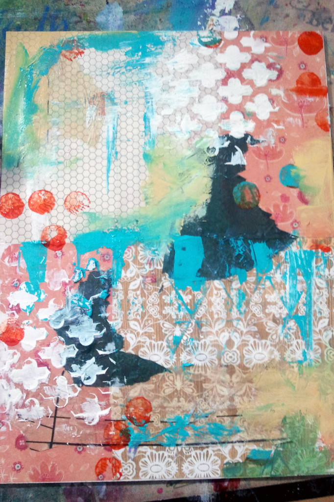
This is what happened with this painting. I had this huge (16×20″) painting, dated from July 2010, made on canvas board. It was ugly; I was in my «grey face round eyes» phase (don’t get me wrong, I love some of what came out during this phase, but definately not this specific one).
Okay, trying not to be ashamed (it is all about the Journey, right ?):
I told you…
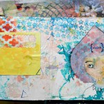
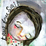
I did not start with any other intention that create another Nixie based on the January painting from Mindy’s True Free Spirit class (allow me to shorten it to «TFS» please). So I started to play around with paint, creating blocks of color to hide what I really hated, but still preserving what I liked in it.
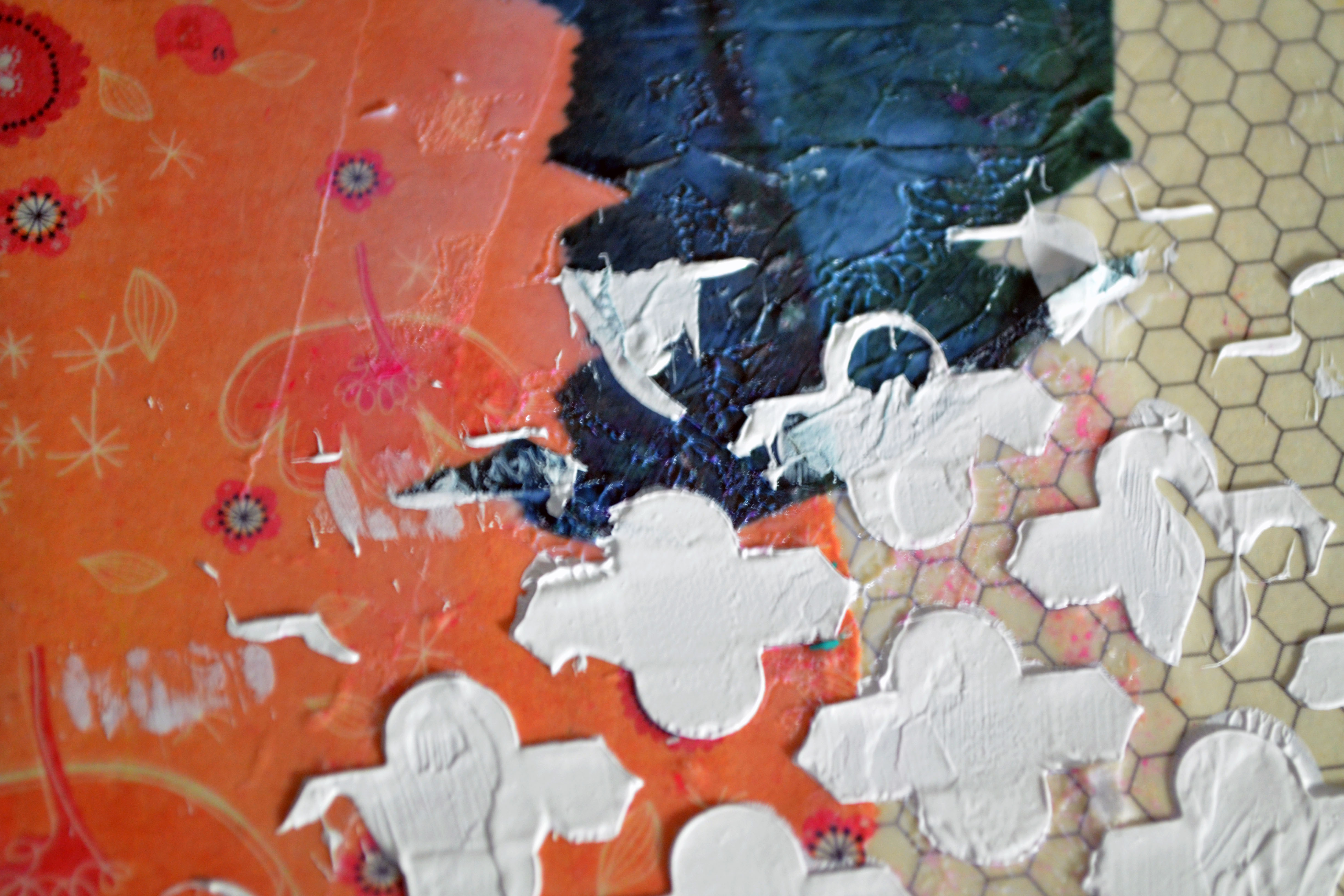
I also used this hexagon stamp I love so much, and went around it to highlight it with one of my favorite color of Oil Pastel (my preferred brand is Senellier).
Still with oil pastel, I did some marks (for example the drops on the top right corner).
I used heavy gesso with a stencil from The Crafter’s Workshop (should I still say it ? you know they have my heart). I used one from Studio Calico, too.
The bright pink pieces are simply tissue paper. The brown part with line at the bottom is tissue paper, this thing used when you sew your clothes yourself you know (a pattern ? I’m not sure of the anglophone term, sorry). The beige part in the middle-left part is tissue paper too, but the wrapping kind; it has kind of a scene design on it. I don’t get tired of using it, because it adds pop, because it is semi-translucent (more or less depending on the color of it).
And last but not least, I used some other stamps (some from Hero Arts for Studio Calico, some from Christy Tomlinson by Unity). I need to check the manufacturer of this circle one I love so much, but I think it is Bo Bunny though.
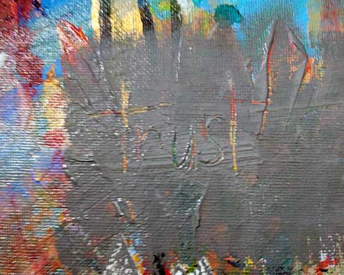
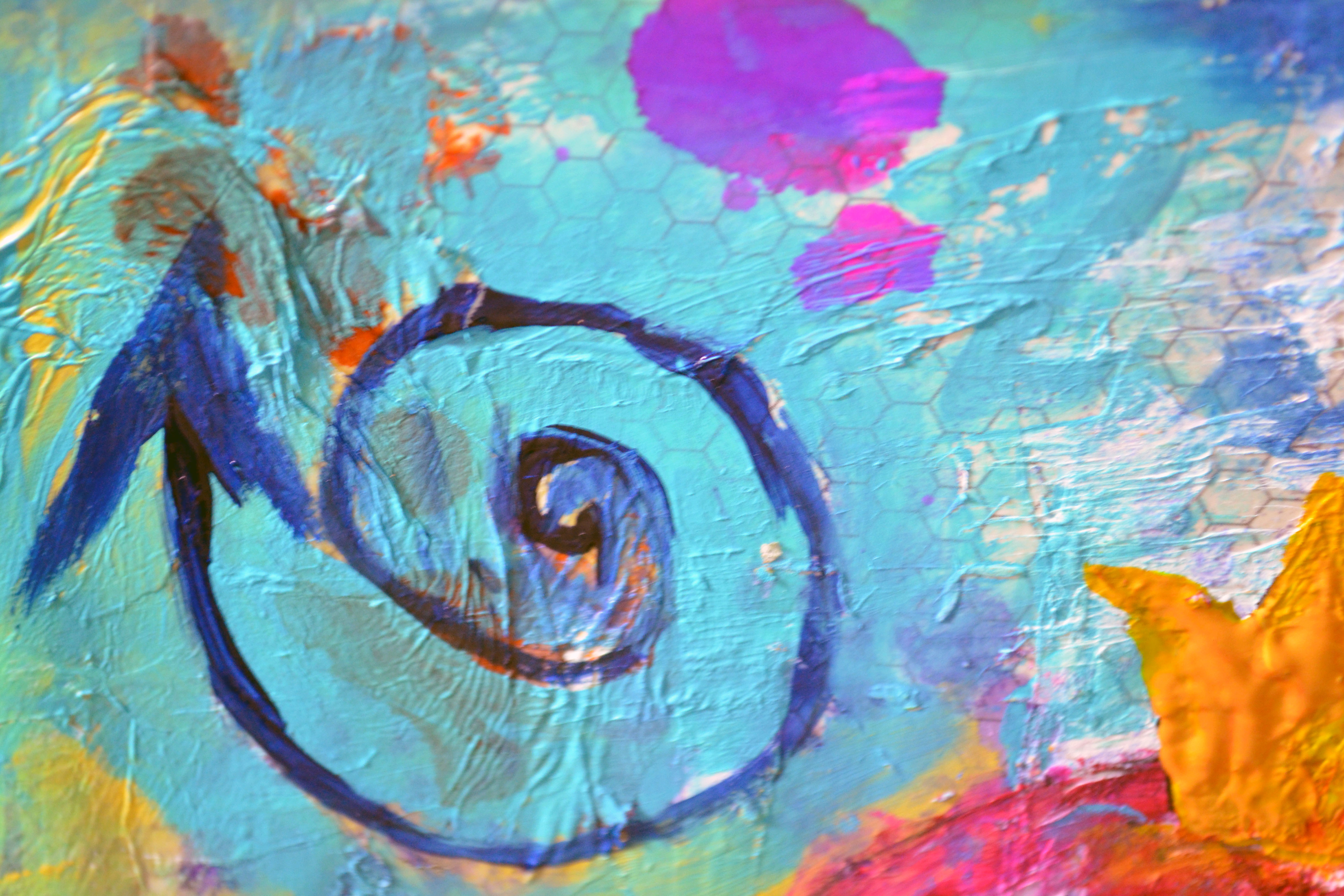
You need to look closely at the painting to actually notice this word. I simply engraved/scratched it whil the paint was still wait. I love the contrast of the warm colors showing through that grey block.
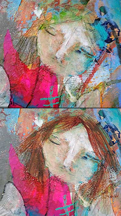
Finally working a bit on her face. She is composed of plenty of layers, very thin layers after layers. This is always the part that scares me, even if I am getting more comfortable in my technique. I think I only have one solution for it: learn how to traditionally shade a face, and go from there. I will.
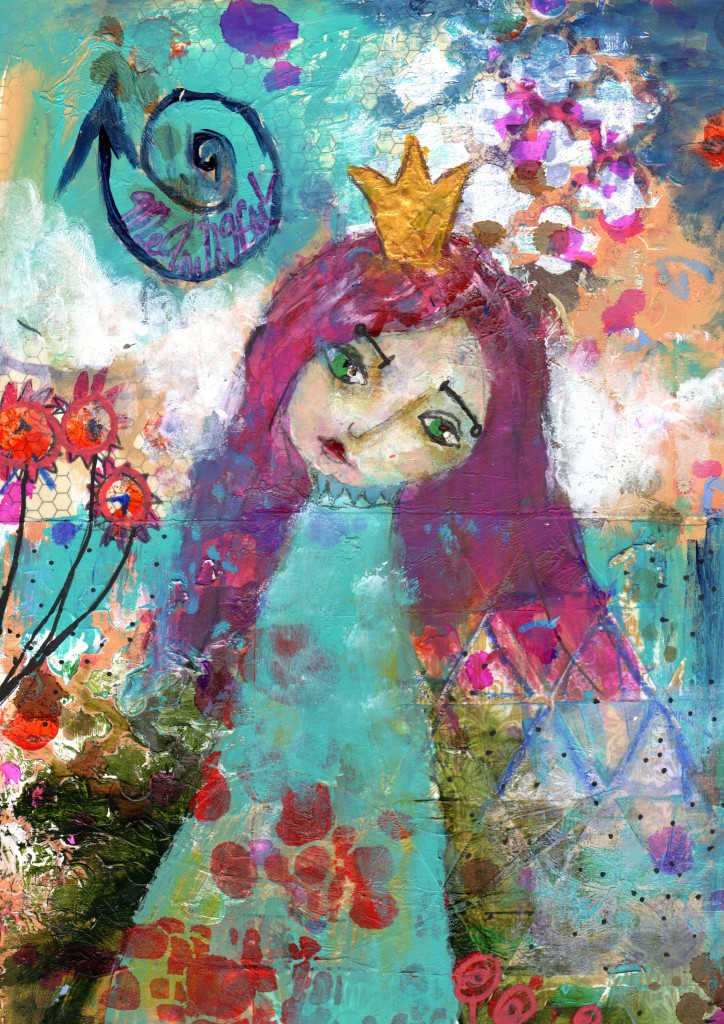
And a dozen of details and layers after, here she is:
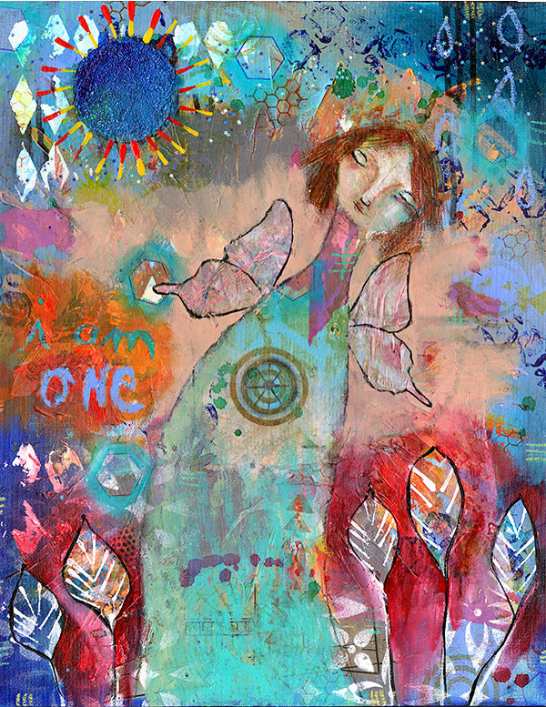
«Fae».
Prints available in the shop.
«If you are not willing for the unusual things, then you’ll have to settle for the ordinary.» Jim Rohn
Here is Fae’s story:
Fae’s look is quirky. Unusual. She has beautiful fragile yet still strong shiny wings. Her hair seems to be all over the place.But she doesn’t care because she knows deep in her heart: she makes One with everything and everyone around her. She is both the Sun and the Moon. The stars in the sky that are still there even when you don’t see them.She is a perfect Being, image of what is.


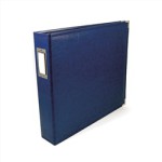 For Project Life, you do need a 12×12″ 3-ring binder because of the photo pages we use. Now, plenty of manufacturers do have some in their lines so it is not that hard to find. AND 12×12″ (30x30cm) is the more common size but of course, you can also choose to a 8.5×11″ album or even 6×8″. It is really up to you !
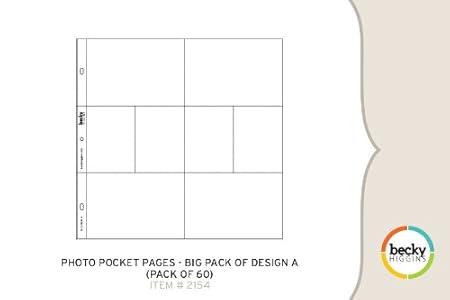 People usually prefer working the Design A when they work on a weekly base for their year album. I noticed by looking through my photo folders on my computer that most of the photos I take are in Landscape mode. And I guess I am not the only one, and this is why this design is oh so popular. And why I like the Photo Pocket C so much: it is 6 spots for 4×6 Landscape photos.
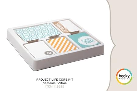 Last year when I began for 2012, I bought the
 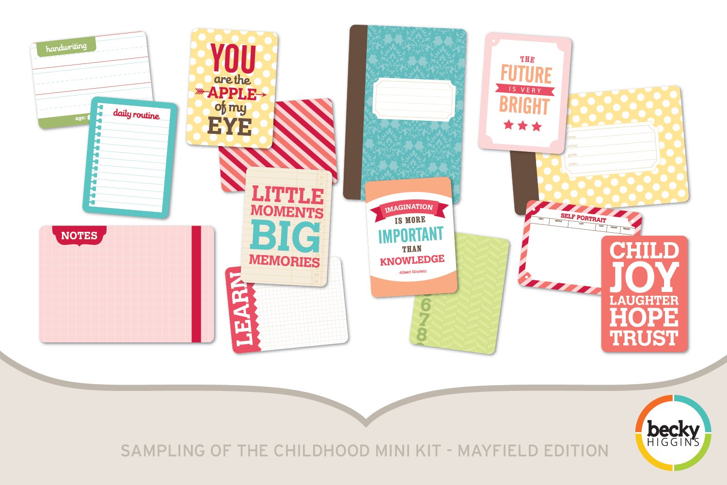 I also use the
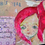
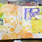
 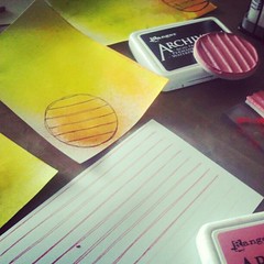 I purchased some blank 4×6 cards at Staples, and use them to create my own journaling and filler cards. You know I like getting my hands dirty, and it is a nice fun way to warm up before painting.
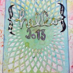
 I had to make this exception though when I discovered this book, «